Responsive Web Design with HTML5 and CSS 3rd Edition
Since 2012, ’Responsive Web Design with HTML5 and CSS’ by Ben Frain, has been Packt publishing’s best-selling book on Responsive Web Design and the latest HTML and CSS techniques and features. Now completely updated 3rd Edition for 2020!
What's new in the 3rd Edition?300+ Info Packed Pages
Media queries, SVG, animations, CSS tranforms, accessibiltity, Flexbox, CSS Grid, CSS Scroll Snap and much, much more.
Sample Code
Chapter code is available for each subject and you also get the code for this site. You’ll be building it bit by bit as we progress!
Latest Edition
The 3rd Edition of Packt’s best-selling Responsive Web Design title since 2012.
Is it for you?
This isn’t a book for absolute beginners; you should have some understanding of HTML and CSS.
We will be taking this example site from nothing more than high quality HTML markup to fully responsive progressively enhanced website using the latest CSS techniques.
What will you learn
Each chapter will teach you the essentials of that subject, before putting the lessons learnt into practice to build this very site!
You’ll learn everything you need to build fully responsive, modern web sites using the latest CSS and HTML features. Still unsure?
Read the chapter summary below.Reviews
Provides a ton of usable, executable advice using good examples and in a very readable style.
– Fredric Retzko
...jam packed with quality information about responsive web design, but what i liked the most is that it also teaches a lot of HTML5 and CSS3
– Mirko Zoric
Awesome stuff. Really recommended for anyone ready to dive into HTML5/CSS3.
– Perovic
New in the 3rd Edition
If you’ve only read the 1st Edition, there’s no question you’ll learn plenty more from the 3rd Edition. However, if you have the 2nd edition, you may be wondering if it’s worth your while. Here’s a selection of the new topics covered in the 3rd Edition:
- Full chapter on CSS Grid
- CSS Scroll Snap
- CSS mix-blend modes
- Greater focus on accessibility
- All about variable fonts
- CSS font loading techniques
- CSS clip-path
- ::focus-within for forms
- CSS custom properties
- CSS environment variables (A.K.A. phone notches)
Mailing List
Full Chapter List
-
Essentials of Responsive Design
By the end of this first chapter, you will have made a responsive web page. Along the way we will get an understanding of where Responsive Web Design came from, the problems it solves and the core tenants of implementing a Responsive Web Design with HTML5 and CSS
-
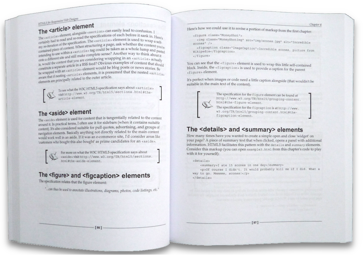
Writing HTML markup
Good HTML markup is the basis for any good web site or application. More importantly, HTML provides a bedrock of understanding for assistive technology. In this chapter we cover everything from the opening
<!DOCTYPE html>to the closing tag. -
Media Queries & Responsive Images
Media queries provide the means to target CSS not just on screen width, but screen height, color preference, screen density (DPI) and a whole lot more. Besides the media query deep-dive, this chapter also covers responsive images; allowing you to provide any number of image permutations based upon the target device.
-
Layout with Flexbox
Flexbox is the most widely supported modern CSS layout system. Once we have covered the syntax and use cases of Flexbox, we get our hands dirty with Flexbox; using it to layout the markup of this very site.
-
Layout with Grid
CSS Grid is the latest layout system. New in this edition is a whole chapter dedicated to understanding the capabilities and efficiencies of CSS Grid. Once we have an understanding we will use our new knowledge to make improvements to our existing implementation of a site design.
-
CSS selectors, typography, color modes and more
This is a dense and varied chapter covering topics such as how CSS selectors work, dealing with typography using @font-face and variable fonts, understanding HEX, RGBA and HSLA color modes plus a whole bunch of extra topics such as text-truncation, multi-column layout, CSS calc and environment variables. Oh and more besides. Phew!
-
Create stunning aesthetics and effects with CSS
Another chapter bursting with CSS goodness. Want to know about text and box shadows? What about multiple backgrounds and linear and radial gradients? Repeating gradients? CSS filters like blur and sepia? Masks and Clipping? Mix-blend modes? It's all in here. Plus we will finish off by looking at CSS scroll-snap; the fancy CSS ability to scroll elements to a specific point – no JavaScript needed!
-
SVG: Scalable Vector Graphics
SVGs are an essential part of a responsive developers toolkit. We cover the most practical use-cases for SVG; how to insert SVGs directly into markup, inside an object element, as a background image and standard image. We also cover creating an SVG sprite sheet, and how SVGs can be animated and optimisied for use on the web.
-
Transitions, Transformations and Animations
Transitions, transformations and animations, when used judiciously, can really bring a design to life. In this chapter we cover all three. Once the syntax and use-cases are covered we will use them practically to create the various transitions, transformations and animations on this site.
-
Forms
This chapter covers everything you are likely to need to know about forms. Topics include accessible form structure, the various elements of forms, form validation and the most recent CSS that allows better control of form visuals than ever before.
-
Guidance and approaches for responsive front-end development
In the final chapter we will bring together all the knowledge learned so far and consider how best to approach a responsive project. We also consider some best-practice techniques to get your responsive HTML and CSS based projects off to the best possible start